Compare Calgary Neighbourhoods by the Data: Three Side by Side
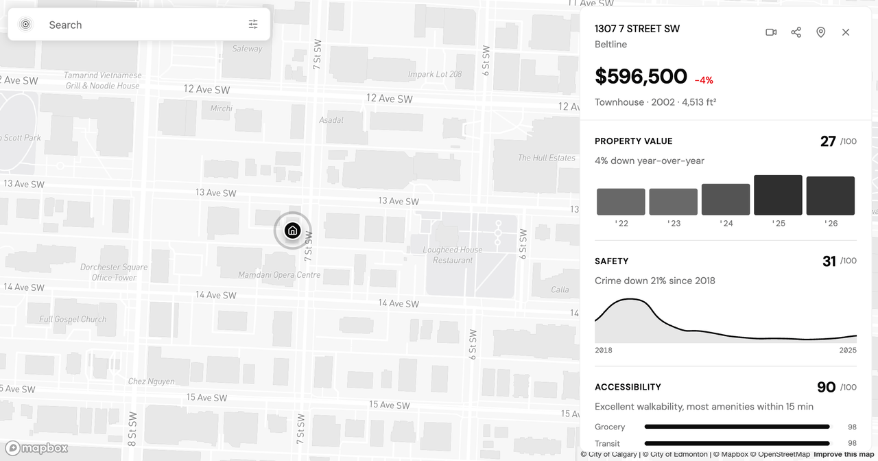
By the time you have a shortlist, the hard part is no longer finding the data. It is holding three sets of it in your head at once. You have looked at Beltline, Sunnyside, and Tuscany, and each place reads well enough on its own. The trouble starts when you try to weigh them against each other: the dense inner-city condo blocks, the quiet pocket across the river, the family suburb on the northwest edge. Which numbers actually decide it depends on what you are optimizing for, and that is the one comparison a single-neighbourhood report cannot make for you.
This post puts those three Calgary neighbourhoods side by side on the measures that tend to move a decision (assessed value and five-year growth, what a 15-minute walk reaches, and how each scores on safety) using figures pulled from PickYourPlace's lenses in June 2026. The goal is not to name a winner. It is to show how the trade-offs surface once the same measures sit next to each other, and how the Compare tool does that synthesis for whatever shortlist is actually yours.
Why the decision moment is when structure matters most
A single report is built to answer one question well: what does this one place look like across value, safety, access, climate, and demographics? That is the right shape when you are still exploring. It is the wrong shape when you are down to your final two or three, because now the useful information is not any one number. It is the gap between numbers. Sunnyside's transit score means little in isolation; set beside Tuscany's, it tells you something. The moment you are comparing, you need the measures aligned, the differences pulled out, and the noise set aside. That is a structural problem, and more browser tabs do not solve it.
What Compare shows: the same measures, neutral framing
Compare reads the Analyze reports you have already generated and turns two or three of them into one decision-support document. Two rules keep it honest. First, it compares like with like: neighbourhoods against neighbourhoods, never a neighbourhood against a single address. Second, it is tuned for a shortlist of two or three, not a long list. The output is not a verdict. It is the same measures laid in adjacent columns, with the trade-offs that matter for your priorities written out in plain language, so that by the end you can see where each place is strong, where it is not, and what you would be giving up either way.
Assessed value and five-year growth
Here is where the three neighbourhoods sit on the Value lens, which combines median assessed value, recent growth, and the local development pipeline.
| Measure | Beltline | Sunnyside | Tuscany |
|---|---|---|---|
| Median assessed value (2026 roll) | $234,000 | $375,500 | $703,000 |
| Five-year growth | +21.8% | +22.4% | +37.9% |
| Year-over-year | −3.0% | 0.0% | −1.0% |
The spread is wide, and one caveat has to come before any reading of it: assessed value reflects the kind of housing that exists in each place, not the price of a comparable home moved from one to the next. Beltline's $234,000 median is a market of condos and apartments, and its census profile is a median age of 34, an average household size of 1.6, and 74.4% renters. Tuscany's $703,000 median is a market of detached family houses, with an average household size of 3.0 and 88.5% owner-occupancy. You are not looking at the same home priced three ways. You are looking at three different housing stocks.
Read against that, the growth figures are the more comparable signal. All three appreciated by roughly a fifth or more over five years, with Tuscany's +37.9% the steepest. The year-over-year numbers are flat to slightly negative across the board, a reminder that a strong five-year trend and a soft recent year can sit side by side, and that past growth is a description of what happened, not a forecast of what will.
Accessibility: the score and the 15-minute walk
The Accessibility lens score is a weighted blend of eight everyday destinations (transit, grocery, dining, schools, healthcare, recreation, retail, and trails), scored out of 100 relative to the rest of the city. The grocery counts below come from a separate measure: what a 15-minute walk from the community's centre actually reaches. This is where the three neighbourhoods pull furthest apart.
- Beltline: 33 grocery stores reachable in a 15-minute walk, transit in the 98th percentile, an accessibility score of 90.
- Sunnyside: 14 grocery stores in a 15-minute walk, transit in the 97th percentile, an accessibility score of 91.
- Tuscany: 1 grocery store in a 15-minute walk, transit in the 35th percentile, an accessibility score of 27.
The two inner-city neighbourhoods score near the top on foot access; the suburb scores low. That is not a flaw in Tuscany. It is the design of a low-density, high-ownership community built around driving. It is a measurable difference in daily life, though. In Beltline or Sunnyside a car is optional for groceries and transit; in Tuscany it is the assumption the neighbourhood is built on. Which of those you want is a genuine preference, not a score to be maximized.
Reading safety alongside value
Safety is a weighted composite scored out of 100: Calgary Police Service incident data blended with traffic history, lighting, urban noise, and proximity to emergency services, each measured against the rest of the city. It is relative, not absolute, and it does not capture unreported incidents or shifts too recent to have landed in the data. With that framing, the three land as follows:
- Beltline: a safety score of 31, with a reported incident rate of 54.3 per 1,000 residents, up 6.8% year over year.
- Sunnyside: 57, with 20.4 per 1,000, down 26.4% year over year.
- Tuscany: 61, with 5.0 per 1,000, up 6.7% year over year.
Theft from a vehicle is the most commonly reported category in all three. The point of putting safety next to value and access is what it exposes: the measures pull against each other. Beltline scores near the top on walkability and low on the safety composite; Tuscany does close to the reverse. That is exactly the kind of trade-off that stays hidden when you read one report at a time and only surfaces when both lenses are in view at once.
How to compare Calgary neighbourhoods on your own shortlist
None of the three neighbourhoods above is the answer, because the answer depends on what you are weighing. If daily walkability is the priority, the data points toward Beltline or Sunnyside. If household space and a higher safety score matter more, Tuscany makes the stronger case, with the daily-drive assumption as the cost. The figures here describe what is; the priorities are yours, and worth talking through with your agent before a showing.
To run the same comparison on the places you are actually choosing between:
- Generate an Analyze report for each neighbourhood on your shortlist.
- Open Compare and select the two or three you want side by side.
- Read the trade-offs it surfaces against the priorities that matter to you, and adjust which lens you lean on.
Each comparison uses one report from your allowance on any plan, and you can see what each plan includes on the pricing page. Whichever way your own numbers fall, the value is the same as it is above: the measures aligned, the differences named, and the decision left where it belongs, with you.
I would love to hear how this holds up against your own shortlist, so please reach out if you have questions or a neighbourhood you would like to see run through the same lenses.
Keep reading
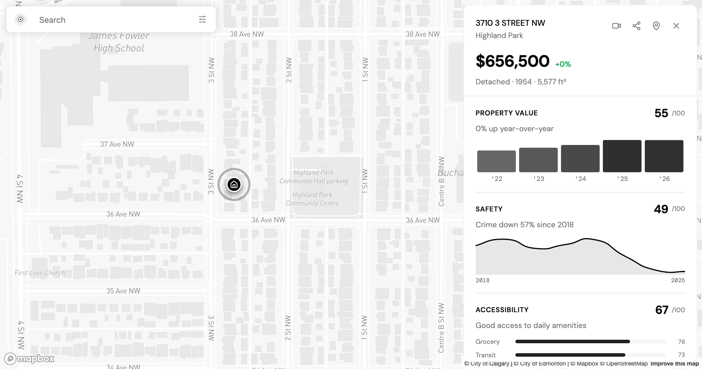
Is Highland Park Calgary Safe? Reading the Inner-North Crime Data
Is Highland Park Calgary safe? We pulled the Calgary Police crime data for this inner-north community and read a safety score of 49 category by category.
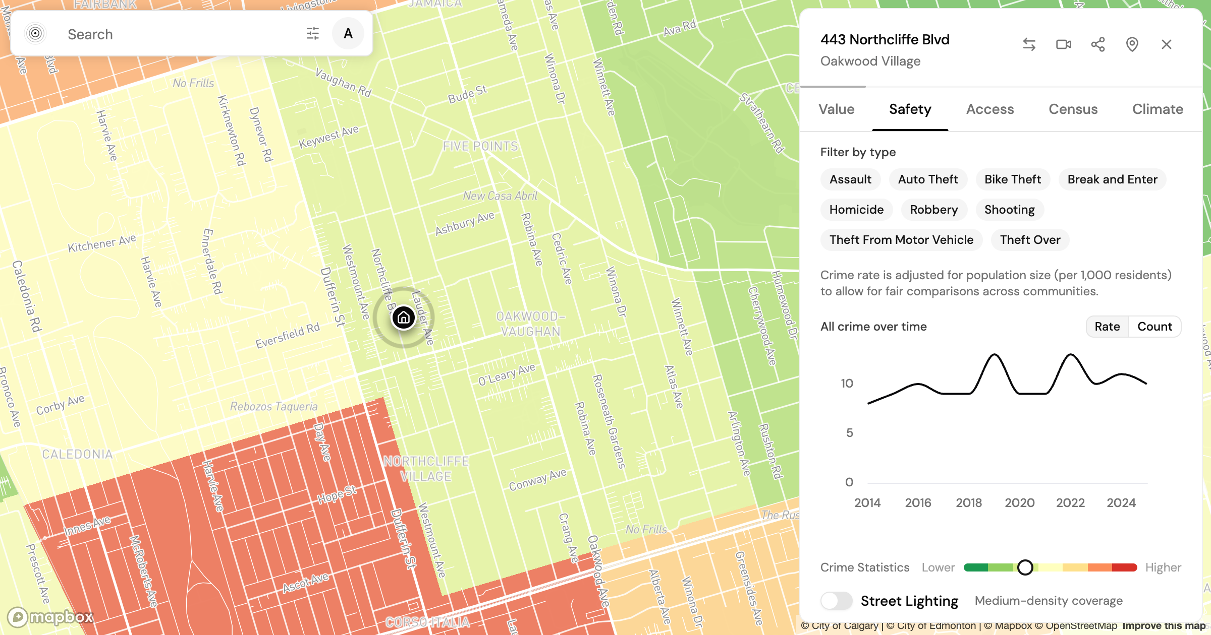
Is Oakwood Village Toronto Safe? What the Crime Data Shows
Is Oakwood Village Toronto safe? We read the Toronto Police crime data by category and trend to show how to turn a safety score into a question you can act on.
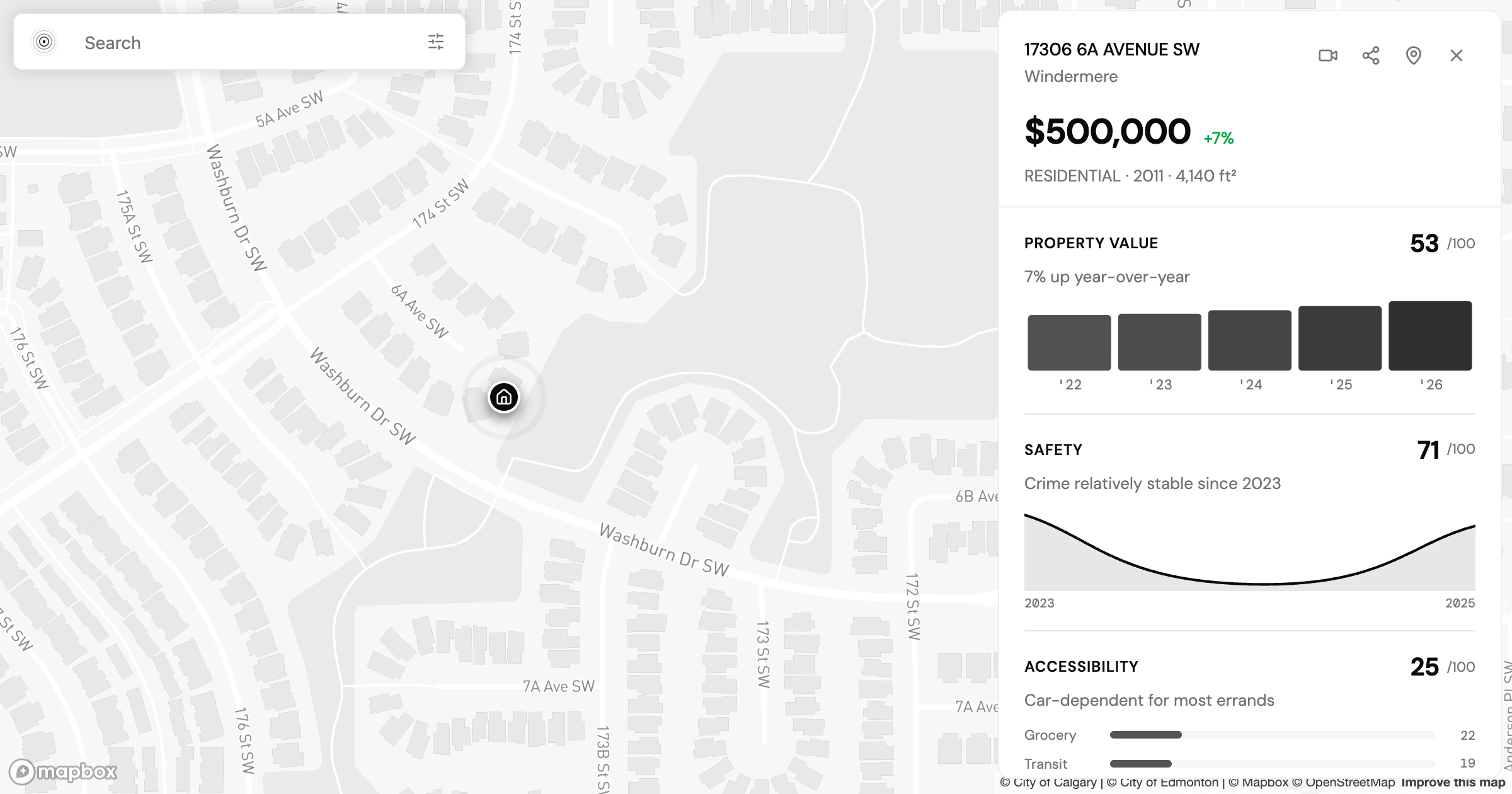
Allendale vs Windermere: Two Edmonton Neighbourhoods, Side by Side
Allendale vs Windermere in Edmonton: two communities at nearly the same assessed value that split on transit, safety, and who lives there. What the data shows.
Find my place
Tell us where you need to get to and we will route it on the real network, then rank the city on how well it serves that.
Find my place