Toronto Walkability by Neighbourhood: The 15-Minute Test
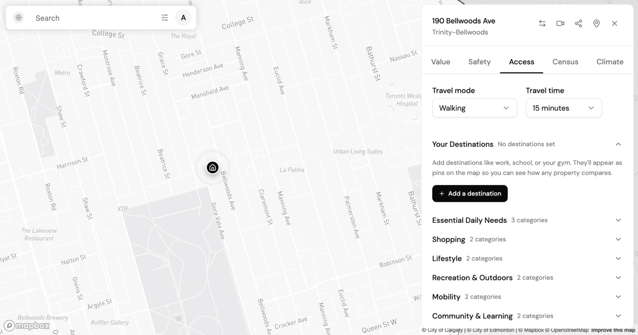
Two apartments in Toronto's west end can look identical on a listing: same price band, same era of brick, both a short streetcar ride from downtown. Then you move in, and one of them puts a grocery store, a pharmacy, and a frequent transit stop inside a 15-minute walk, while the other sends you back to the car for half of those errands. The listing never told you that. Neither did the generic walk score stamped on the page.
Walkability, how much of daily life sits within walking distance of your front door, is one of the five lenses PickYourPlace scores for every Toronto neighbourhood we cover. It is also where Toronto walkability by neighbourhood gets misread most often, because two communities that share a streetcar line and a reputation can sit a long way apart on the data. Trinity-Bellwoods and Roncesvalles are barely three kilometres apart and get grouped together in almost every "best west-end" list. On the accessibility numbers, they are not the same place.
In this post, I will show you what Toronto walkability looks like when you measure it from a specific address instead of a city-wide average: what a 15-minute walk reaches from each community, where the numbers diverge, what the transit percentile means for a commute, and how to run the same test on any address. Every figure below comes from PickYourPlace's Toronto dataset, pulled on 2026-06-29.
Why a walk score and a 15-minute walk are not the same thing
A walk score is a single number attached to an address, and most of the popular ones are city-wide averages dressed up as local detail. They draw a circle around your dot and count what falls inside it, without knowing that a rail corridor, a ravine, or a one-way arterial stands between you and half of those destinations. The circle does not walk; you do.
An isochrone measures the other way. An isochrone is the actual area you can reach from a point within a set time (15 minutes on foot, here), traced along the real street network rather than as the crow flies. PickYourPlace draws it with Mapbox's walking isochrone service, so a dead-end street, a park with no through-path, or the rail lines that cut across the west end shape the reachable area the way they shape your real walk. Inside that shape, PickYourPlace counts the everyday destinations you can reach (groceries and food, transit stops, schools, health services, recreation, and retail). The Accessibility lens score is a related but separate measure: it blends eight kinds of everyday destinations into a score from 0 to 100 against the rest of Toronto, where a higher score means more of daily life sits within range.
15 minutes on foot from Trinity-Bellwoods
Start at Trinity-Bellwoods. Draw a 15-minute walking isochrone from the heart of the community and the Accessibility lens counts 65 grocery and food options inside it: full-service grocers, independent shops, cafés, and restaurants you could reach without starting the car. That density gives Trinity-Bellwoods an accessibility score of 87 out of 100, near the top of the scale.
The people living inside that walk shape it too. Trinity-Bellwoods skews slightly toward owners, at 55.8% owner to 44.2% renter, with a median age of 39 and an average household of 2.3, the young-professional-and-small-family mix you would expect where a car is optional rather than assumed.
The same walk from Roncesvalles, and where the numbers diverge
Roncesvalles is close enough that many buyers treat the two as interchangeable. The accessibility data draws a line between them. A 15-minute walk from Roncesvalles reaches 53 grocery and food options, 12 fewer than Trinity-Bellwoods, and the community's accessibility score is 71. Still strong, but a measurable step down: the difference between "almost everything is close" and "most things are close, and a few errands are a longer trip."
The tenure mix leans the other way, too. Roncesvalles runs 45.4% owner to 54.4% renter, with a median age of 40 and an average household of 2.2. For a third west-end reference point, Dufferin Grove sits between the two on this lens, with a score of 82 and 58 grocery and food options inside a 15-minute walk. Three adjacent communities, one shared reputation, three different numbers.
What the transit percentile means for your commute
Groceries are the errand you notice; transit is the one you pay for daily, in minutes. The Accessibility lens scores transit access as its own percentile, and here the two communities sit closer together: Trinity-Bellwoods in the 84th percentile, Roncesvalles in the 74th. Dufferin Grove tops both, at the 87th.
A percentile is not a commute time. It measures how much frequent transit sits within walking distance of the address, relative to the rest of Toronto, not how long the 501 Queen car takes to crawl downtown at 8 a.m. What it tells you is your starting position: from an 84th-percentile address you are more likely to have a frequent stop within a short walk and a choice of routes when one is delayed, while at the 74th percentile the walk to frequent service is a little longer and the daily minutes add up. Neither number decides the question for you; both narrow it before you have booked a showing.
How to run this test on any Toronto address
You do not have to take my two neighbourhoods for it. To test an address yourself:
- Open the Explore map and search the address, or drop a pin on it.
- Switch to the Accessibility lens and draw the 15-minute walking isochrone. The map shades the real area you can reach on foot and lists what falls inside: groceries, transit, schools, parks, and more.
- For the full picture, generate a report in Analyze. It runs the Accessibility lens alongside property value, safety, climate, and census, and, if you save the places you commute to, adds travel-time estimates from that specific address.
Run those steps on two or three addresses from your shortlist and the gaps a listing photo hides start showing up in the numbers.
The same lens, one province over
If you are reading this from Toronto but weighing a move west, the useful part is that the lens does not change when the city does. The accessibility score you just read for Trinity-Bellwoods is calculated the same way for every Calgary and Vancouver community, so you can line up the walk you have now against the one you would be buying into. We mapped that corridor directly in which Calgary neighbourhood matches your Toronto one, and if you are moving you can tell us where you're coming from so the comparison starts from the right place.
Whichever city you land in, the point holds: walkability is not something you can read off a listing photo, and it is not one city-wide score. It is a specific number for a specific address, worth measuring before you commit. I'd love to hear what the data shows for the neighbourhoods you are weighing, so reach out any time.
Keep reading
Is Highland Park Calgary Safe? Reading the Inner-North Crime Data
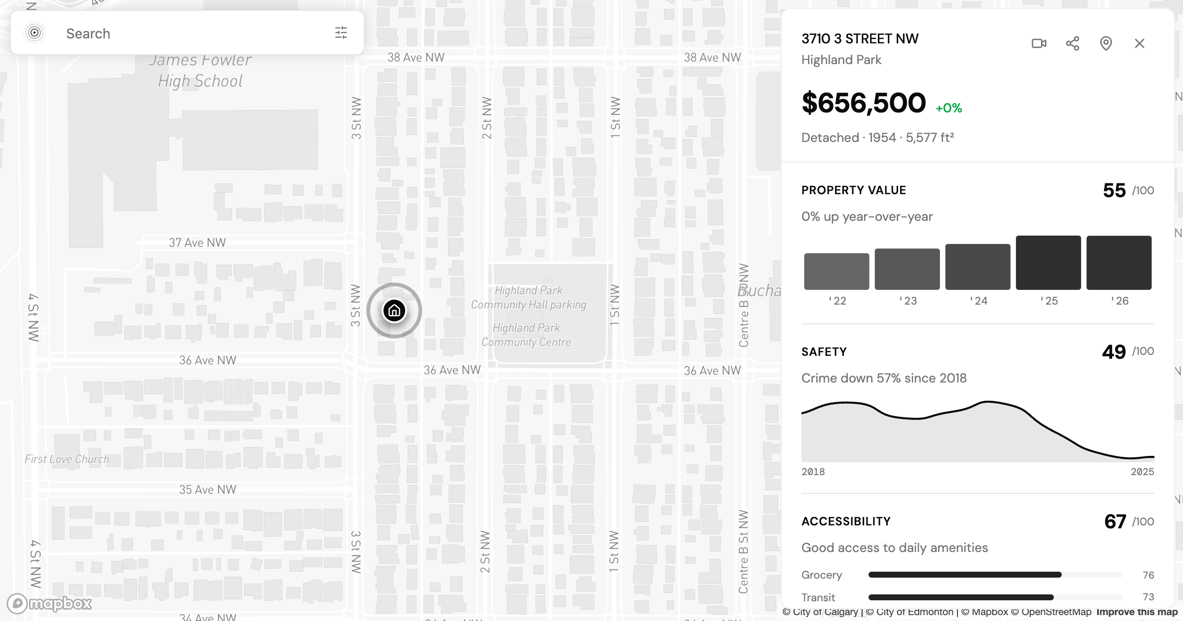
Is Highland Park Calgary safe? We pulled the Calgary Police crime data for this inner-north community and read a safety score of 49 category by category.
Is Oakwood Village Toronto Safe? What the Crime Data Shows
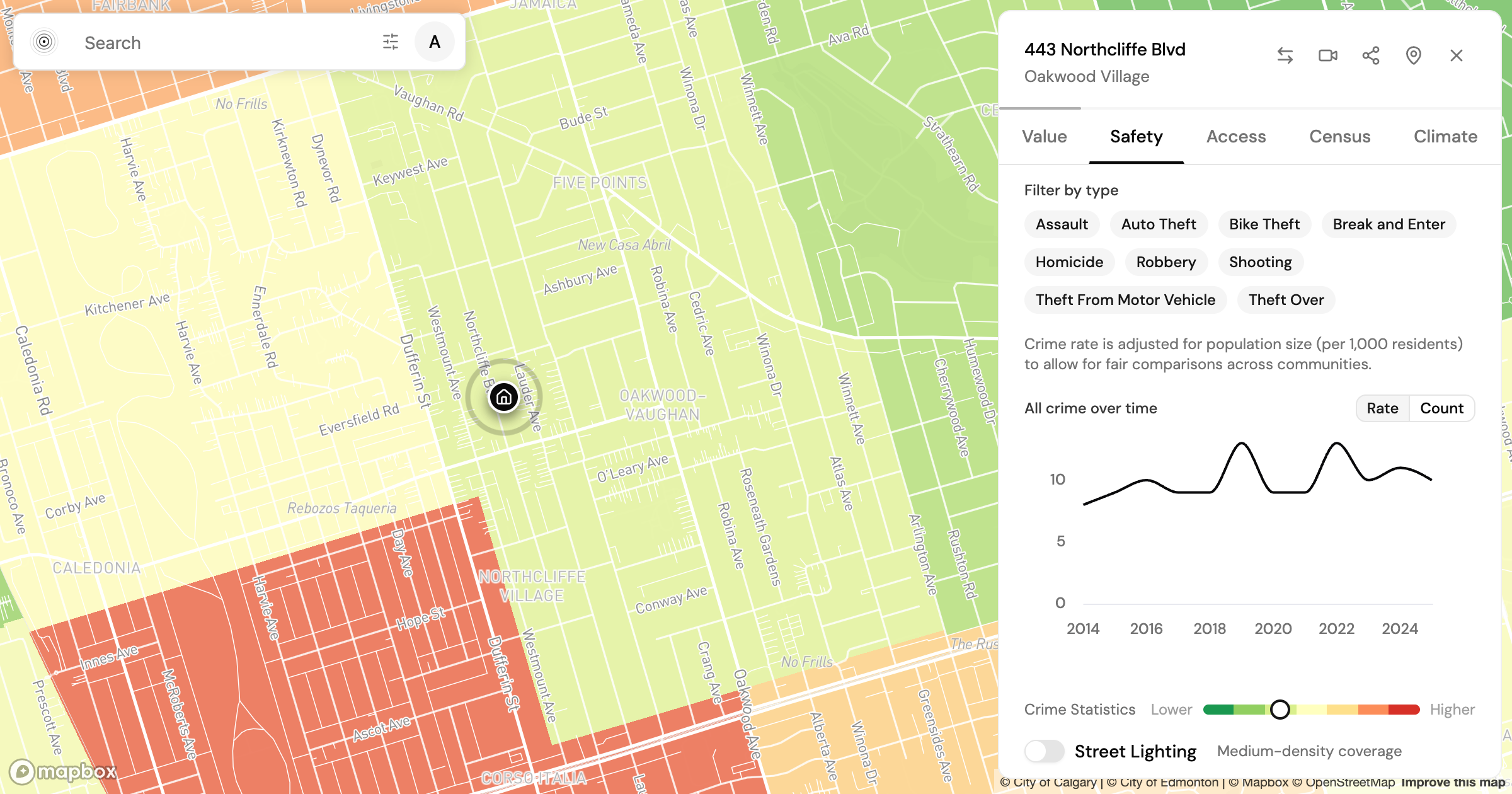
Is Oakwood Village Toronto safe? We read the Toronto Police crime data by category and trend to show how to turn a safety score into a question you can act on.
Allendale vs Windermere: Two Edmonton Neighbourhoods, Side by Side
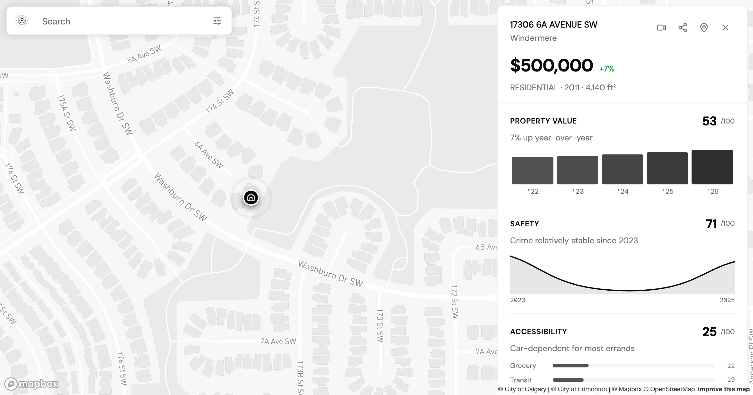
Allendale vs Windermere in Edmonton: two communities at nearly the same assessed value that split on transit, safety, and who lives there. What the data shows.
Find my place
Tell us where you need to get to and we will route it on the real network, then rank the city on how well it serves that.
Find my place