Is This Calgary Neighbourhood Safe? How to Read the Crime Data Instead of Fearing the Score
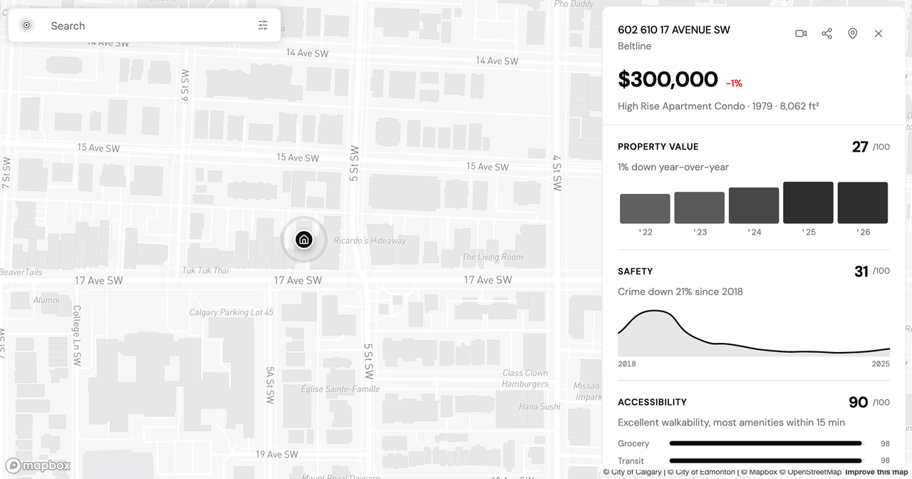
Safety is usually the first question a homebuyer asks about a neighbourhood, and it is the one most likely to end a search before it starts. You find a condo that fits the budget and the commute, you pull up the numbers, and a single figure stops you: a safety score of 31 out of 100. The instinct is to close the tab. But a low score is a starting point, not a verdict, and reading it that way changes which neighbourhoods you rule out and which you look at twice.
This post walks through how to read a Calgary neighbourhood's safety data the way it is built to be read: as a set of components you can pull apart, not a single grade. We will cover what a percentile actually measures, how to read the crime breakdown and the multi-year trend, why a score points you toward the next question rather than answering it, and how to weigh any of it against your own routine. Beltline runs through the piece as a worked example, because it is one of Calgary's most misread neighbourhoods.
Why a one-word label misleads
"Is it safe?" wants a yes or a no. The data does not carry one. A composite safety score blends several separate things: reported crime, traffic incidents, street lighting, noise, and how close police, fire, and health services are. Beltline's composite is 31 out of 100 against a citywide median of 48. Read as a grade, 31 looks like a fail. Read as a blend, it is telling you that one component (reported crime volume) is pulling hard while another (emergency-service access) is holding the number up. Beltline's police access sits in the 87th percentile citywide, fire in the 84th, and health in the 80th. The single number hides that split, and the split is where the decision actually lives.
What a percentile actually means
A percentile ranks a neighbourhood against every other neighbourhood in the same city, not against an absolute line between safe and unsafe. Beltline's crime component sits in the 5th percentile citywide, which means it reports more crime than roughly 95 percent of Calgary communities. It does not mean 95 percent of anything happens to you. Two things are worth holding onto:
- Percentiles are relative. A dense inner-city core will almost always rank worse on reported crime than a low-density suburb, partly because more residents, businesses, and nightlife pack more reported incidents into the same square kilometre.
- Volume is not the same as rate, and rate is not the same as your risk. A high count reflects how much gets reported, filtered through density and a daytime population that per-resident math never counts.
So a low percentile on the crime component is a flag to read further, not a conclusion. It tells you where a neighbourhood sits in the pack, and nothing yet about which incidents make up the total.
Reading the breakdown, not the headline
Once you stop treating the composite as the answer, the useful work starts. A neighbourhood with high vehicle theft is a different place to live than one with high assault, even at the same score. In Beltline, property crime is the bulk of the volume, and theft from vehicle is the single largest and fastest-growing category: 456 reported incidents in 2025, up 39 percent in a year. Assault runs high for the city at 16.1 per 1,000, yet it fell about 6.5 percent that same year even as the overall count rose 6.8 percent. Three questions pull a breakdown apart:
- Which categories? Vehicle theft is insurable and partly within your control through where and how you park. That is a different kind of risk than violence against people.
- Which direction? A number rising is a different signal than the same number falling. Beltline's overall count ticked up in 2025 on vehicle theft alone, while assault moved the other way.
- What context? Street lighting, traffic safety, and noise fill in the daily-life picture. Beltline's noise score is the worst in the city, which says more about 17th Avenue on a Friday night than about crime.
The composite smooths over exactly these differences. The categories are where a neighbourhood stops being a badge and starts being a place you can picture living in.
A score is a door, not a destination
Here is the reframe that makes the number useful: a low score is an instruction to look closer, not a reason to walk away. A 5th-percentile crime reading in Beltline tells you to ask which crimes, on which blocks, trending which way. It does not tell you to cross the neighbourhood off a list. Communities are scored as a whole, but people live on a block, and the stretch above a 17th Avenue bar and a quiet block of 13th Avenue share one community score and two different realities.
The way to open that door is to go one level deeper. The Safety lens on the Explore map lets you toggle crime categories, street lighting, and traffic for any Calgary community and compare it against its neighbours. A full Analyze report breaks a specific address down across crime statistics, emergency-service access, street lighting, and traffic safety, so the one number becomes a set of readable parts you can weigh yourself.
Framing safety against your own routine
The same data supports opposite decisions depending on what you are optimizing for, and that is the point rather than a flaw. If you keep a car on the street and value walkability and fast emergency response, Beltline's trade-off (high vehicle theft, strong access) may be one you accept and plan around. If a high reported-crime count is a dealbreaker whatever the mix behind it, the same numbers point you toward walkable but lower-crime communities instead. Neither reading is more correct. The score does not choose for you; it hands you the parts to choose with, against the routine you actually keep.
What the data will not tell you is how safe you feel walking home at 11 PM, how much goes unreported, or how a 3 PM block differs from the same block at 2 AM. Those gaps are real, and worth naming before you lean the whole decision on any single figure.
So the honest answer to "is this Calgary neighbourhood safe?" is another question: safe compared to what, against which risks, and for whose routine? Start with the Safety lens on the Explore map, read the breakdown rather than the badge, and if you want the full category-by-category and multi-year view for a specific address, generate an Analyze report. If you are weighing several addresses at once, a higher plan raises the monthly report and advisor message limits, and side-by-side Compare draws on the same report allowance (see the plans). For the full worked example, our Beltline safety breakdown reads every one of these numbers in context, and how our neighbourhood scoring works shows where the composite comes from. I would love to hear how you read these scores, so please reach out if a number ever looks off or leaves you with a question.
Keep reading
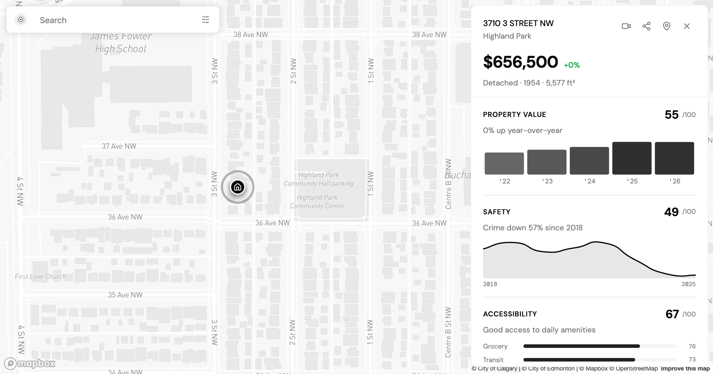
Is Highland Park Calgary Safe? Reading the Inner-North Crime Data
Is Highland Park Calgary safe? We pulled the Calgary Police crime data for this inner-north community and read a safety score of 49 category by category.
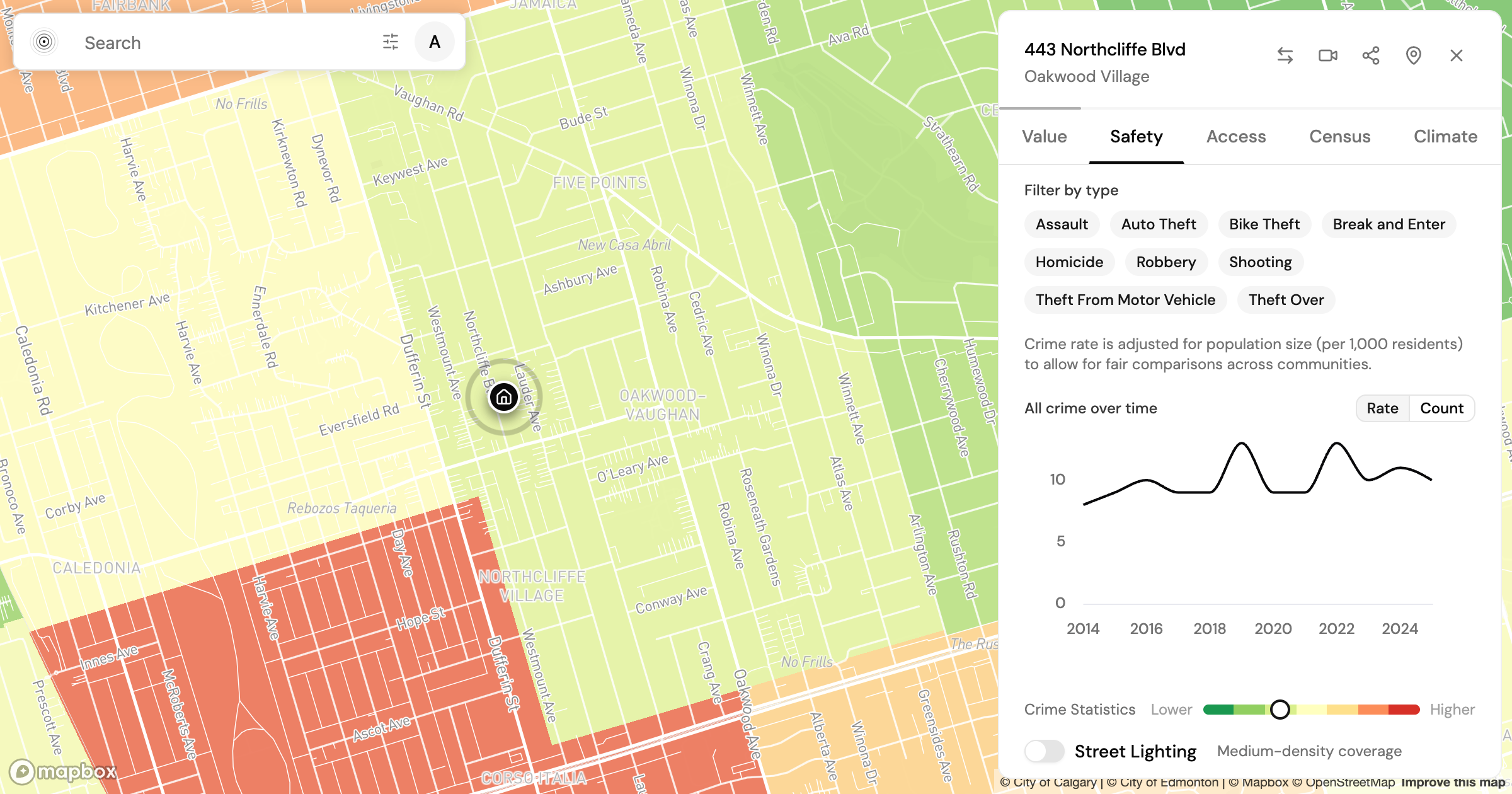
Is Oakwood Village Toronto Safe? What the Crime Data Shows
Is Oakwood Village Toronto safe? We read the Toronto Police crime data by category and trend to show how to turn a safety score into a question you can act on.
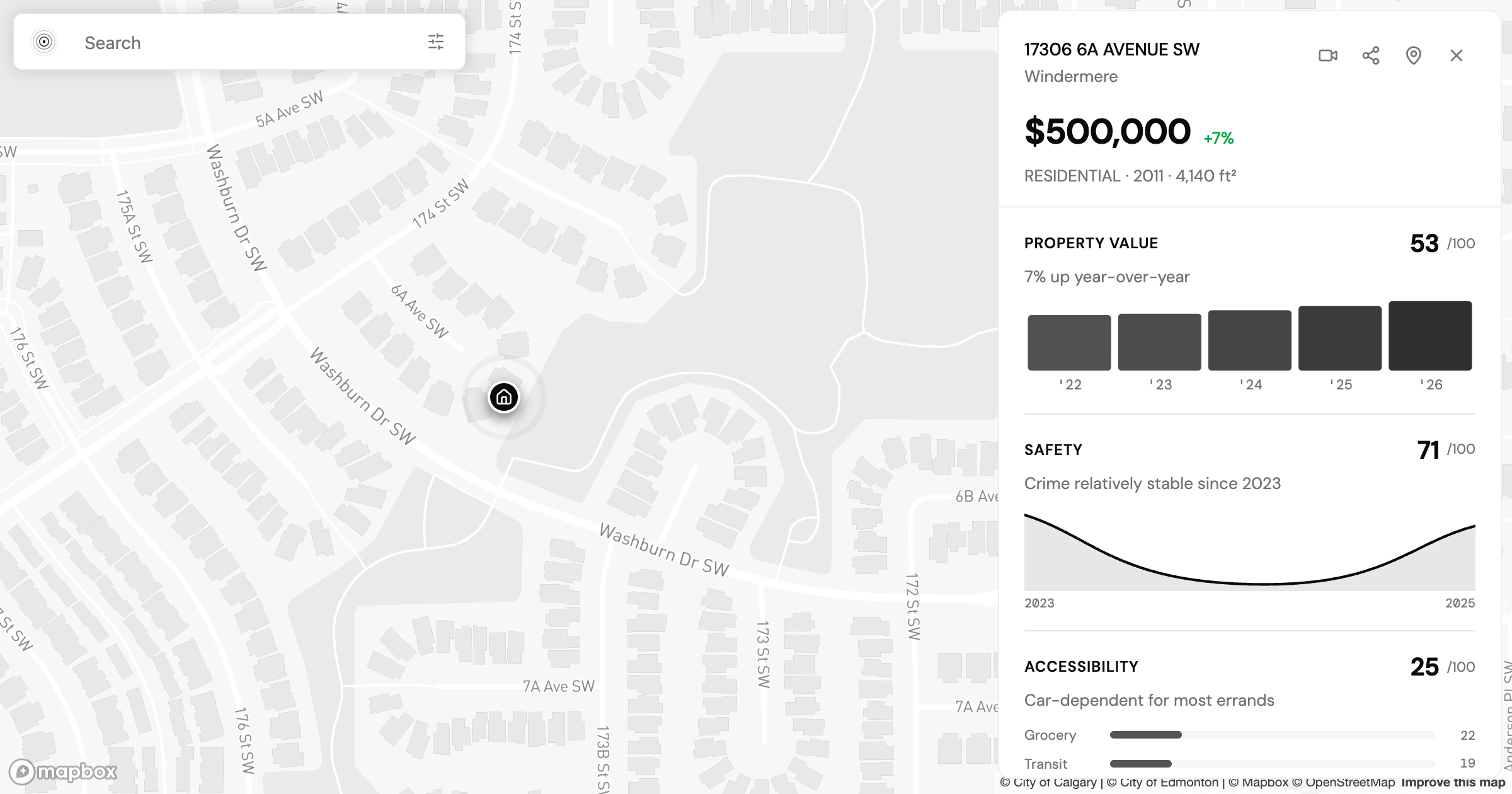
Allendale vs Windermere: Two Edmonton Neighbourhoods, Side by Side
Allendale vs Windermere in Edmonton: two communities at nearly the same assessed value that split on transit, safety, and who lives there. What the data shows.
Check a neighbourhood
Every neighbourhood has a page with its safety rank, what that rank measures and what it cannot tell you. Free, and no account.
Check a neighbourhood